Siiip
Brand Identity

Project navigation
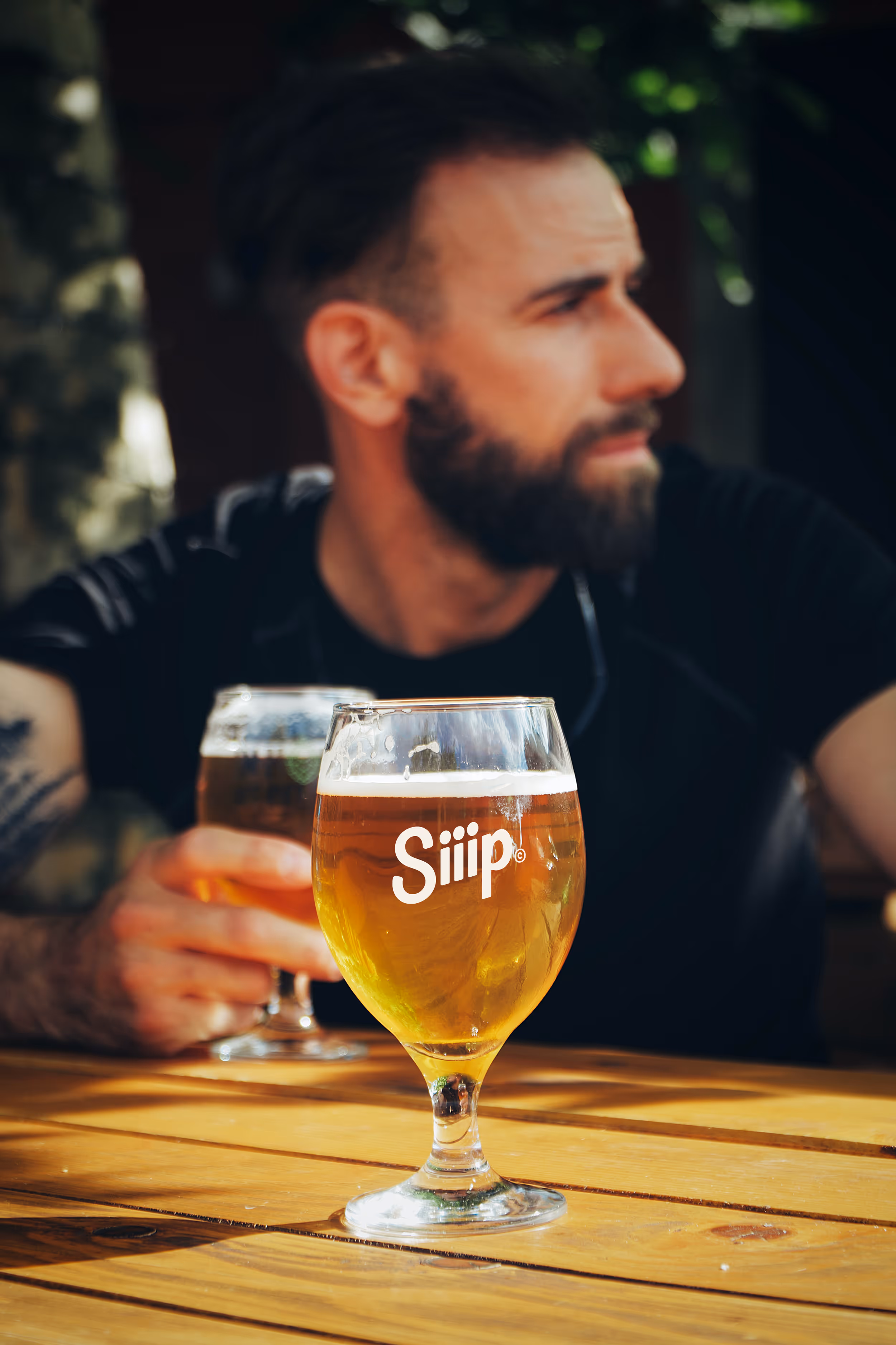
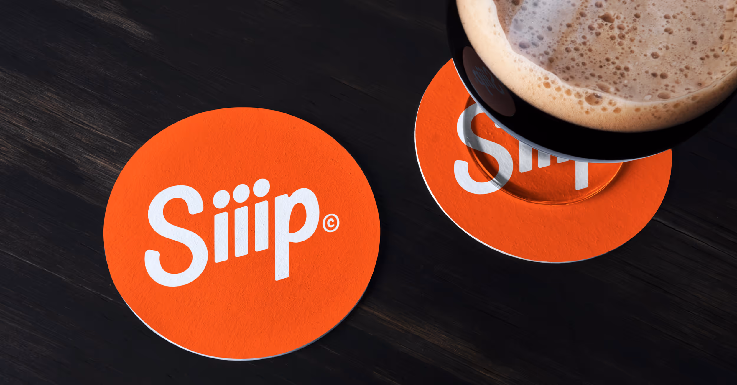
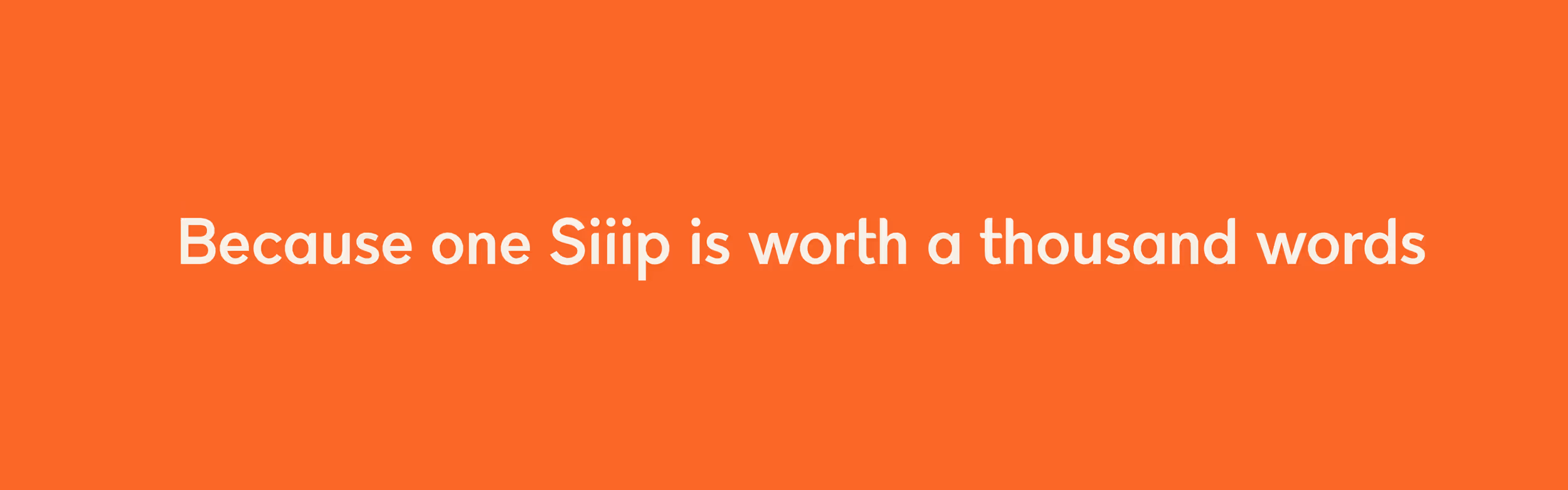
Building a brand around buying a drink for a friend from anywhere in the world.
With Siiip, you can buy friends and loved ones drinks at their favorite local breweries and coffee shops with a simple swipe of your finger from anywhere in the world. We teamed up with this Bozeman based startup to bring their idea from concept to a fully realized brand.

Services Provided
Branding
Brand Naming
Copywriting
The new Identity, explained.
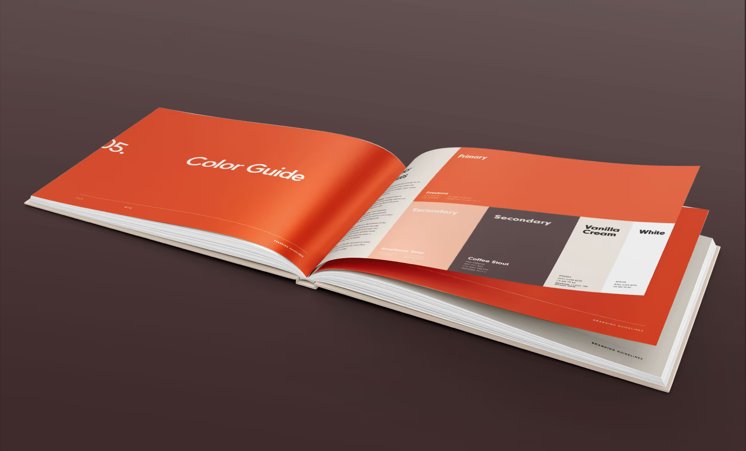
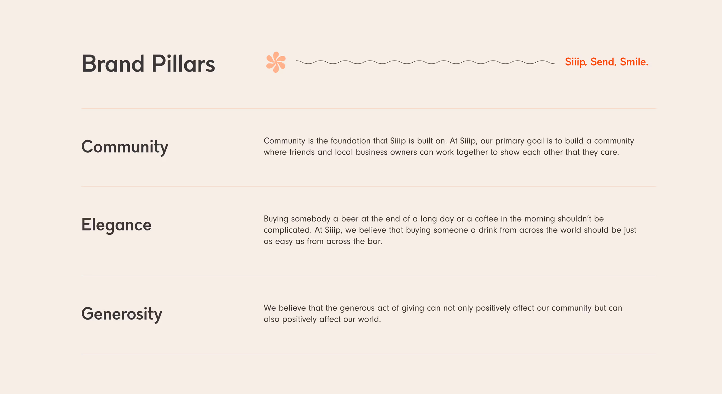
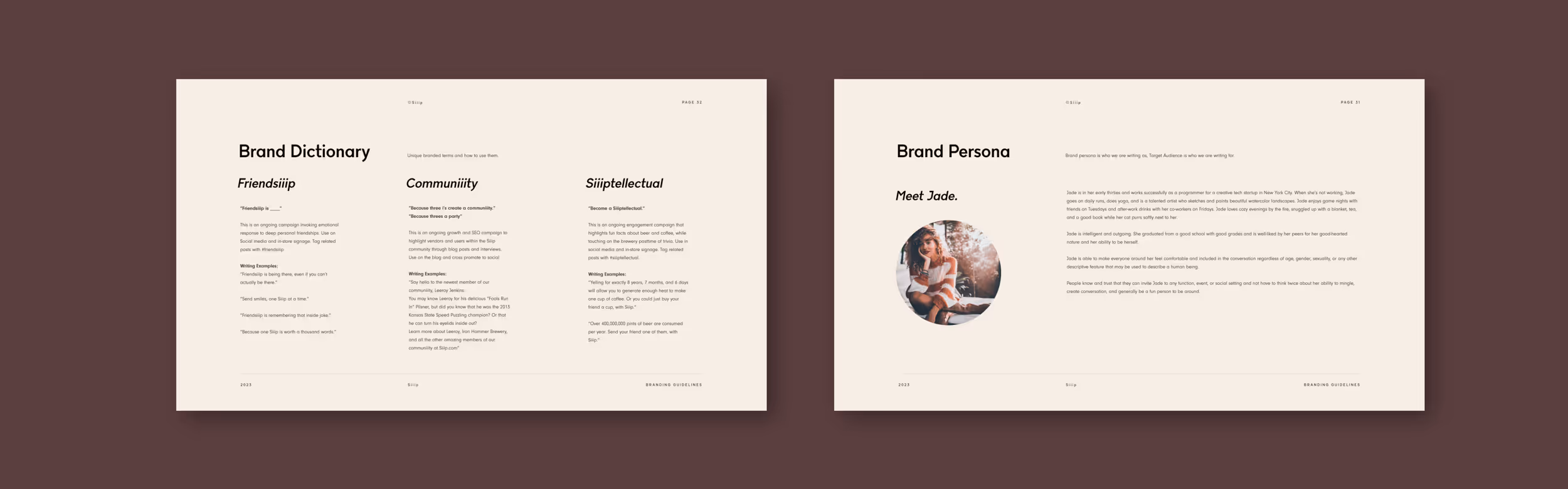
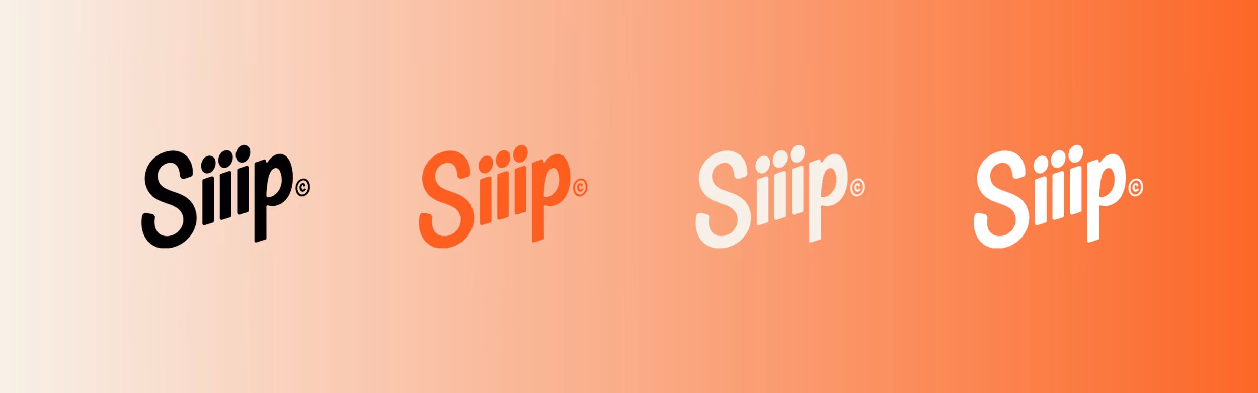
With the logo mark in place, we expanded into brand colors, typography, brand voice, and supporting elements. This was all neatly organized into a 33 page guidelines document allowing the client to consistently channel their brand through all touchpoints. Included in the brand voice were branded campaign ideas through the use of a brand dictionary, jumpstarting marketing and content creation for the startup.
Results
At the time of writing, it's too early to say what the full results of the branding process for Siiip will allow for them to achieve. That said, we do know they are already working with clients closely to develop the technology and hope to launch publicly soon!